Friday 25 November 2011

lessons on composition

Composition
- arrangement of elements within your photograph
- how elements are captured within your scene
- important factor how ur viewers will respond to ur photographs
- important to consider when making photograph
- there are no hard-and fast directions for crafting good compositions
-acknowledge that it exist & find a way to convey the intention of your photograph
- intention will guide your decisions abt composition
- learnto view a scene with diff frame of mind
- use sbj matter to make image clearer
- notice absolutely everything in your scene
- determine what is or is not important
- what will viewers notice first? 2nd? 3rd?
- How do the various elements relate to each other?

Gestalt and Image Composition
- Theory developed in the 1920s by German psychologist
- Describe human brain as holistic
5main principles
- Similarity
Continuation
Closure
Proximity
Figure/ground

Additional Issues of perception
- Light vs Dark --- High key photographs are visual info that is mostly lighter than middle grey, mid tone used lesser. Low key are info that is mostly darker than middle grey.
- Shapes ----eyes tend to complete geometric shapes although others may not see it.
- Foreground vs Background --- appears larger in a photograph than do background elements
- Format of Photograph --- horizontal more peaceful.
- Horizon Line . horizon line m'b real or imaginary, tends to divide the sense in section
- Colors in photograph --- cool toned obj( yellow orannge...

Edges of photograph
- leading lines within the photograph can lead the viewer into it, instead of out of it.

Movement within photo
- give a running person enough space within the photograph to run

Perspective and depth
- give a sense of 3dimensional depth to a 2dimen
- depth lies within the viewers perception
- select depth that match field
Rule of thirds
- elements look more interesting in rectangle
- place important elements at any of the 4intersections (lines put like tic tac toe)

Remove Clutter
- you are responsible for the content o
include only visual material that support ur image

White spaces
empty, or extremely out of focus
used very light colors or very dark

Other compositional elements
- patterns
touch of color
motion

Tuesday 15 November 2011

My 3 final design projects

1st design
- move design to the selected scale size page. (16inch x 20inch & 300pixels)
- ctrl T to adjust the scale according to the size of the page.
- use brush draw the outline
- used the shape tool which is the rounded rectangular tool for the windows and doors of the airplane.
- then continue on the outlines with brush tool.
- after using the brush tool and paint bucket to color the whole picture to make it even and fill up the empty spaces.

- after coloring I used the blur effect from filter; blur; smart blur.
- I filter again by using the texture.
before after
2nd design
- by using the gradient tool I used it for the grass to mix the color evenly.
- Filter the grass with craquelure.
- also used the gradient tool for the lake/water.
- used a dark blue for the outline of the lake.
- filter it with texturizer.
after that using the brush tool to color everything. Putting some shadings on the stones with dark colored gray and outlining .
before after
3rd design
- use tool brush to outline all the lines.
- so that I could use the magic wand tool to color it easily.
- using the bucket tool to color the buildings.
- filtering the buildings with texturizer.
- colored the sky with gradient tool with the mixed of different kinds of blue colors.
- colored the glass with very light cyan color.
- use filter for the sky and the glasses. To make the glass look a little real.
- magic wand to select areas of the tents and cup use paint bucket to color it.
- filter the tent with plastic wrap which makes the tent look like the sun is shining on it.
- use gradient again for the side path and the road where the hand phones are.
- filter the ground with texturizer.
before after

Monday 10 October 2011

Brief intro on Art Movement

Art movement--- comes from different periods of time that can change revolution/ becomes popular.

Movement of cultural ideas
  • Birth of graphic designs: Traced to 30k years ago - cave painting
-Gutenberg's printing press. 550
  • Art Nouveau (International Style 1890-1910)
- Jules Cheret, father of modern poster
- Henri de Toulouse - Lautree known for posters
  • Mackintosh- designers, architect, water colorist / organic forms celebrated nature
  • German designers - produce art work over 30years and also advertising posters
  • William Morris
- founded Kelmscott Press 1890
- He was against mass production and so, he favored good craftsmanship & clean design
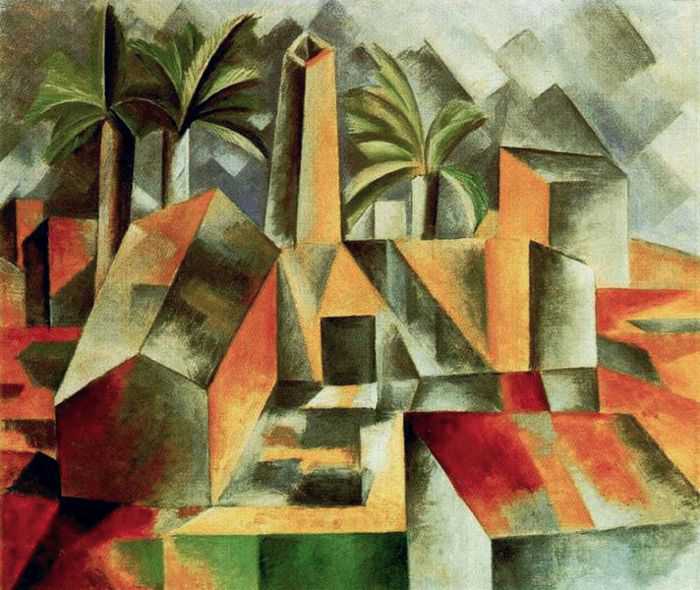
  • Cubism
- a type of art movement, emphasized flat surfaces
- influenced many movements
  • examples of cibism
  • Fauvism led by Henri Matise, favored wildly expressive colors.
  • Expressionism
  • Nature no longer form of reality
  • Plakatstill
- terms for flat colors and shapes
- Lucian Bernhad known for his signature stylized posters.example of Plakatstill
  • Dadaism
- 1916
- questioned meaning itself
- created photo montage created intentional disorder (create chaos)
example of dadaism


Monday 19 September 2011

Research and Reference- 1st Assignment

Naive Art
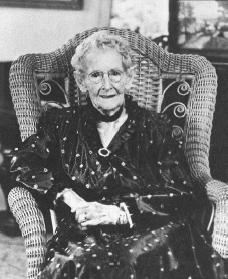
Anna Mary Robertson "Grandma Mosses" (1860-1961)

Anna Maru Robertson born in Greenwich, New York and was one of the best known artist in America who did not have any formal art education. She was the third of ten children born to a farmer Russell King Robertson. When Grandma Mosses was young she loves to draw happy colorful scenes.

Naive art is almost similar to Folk art but they are different in the way where naive art is less concerned with social structures, political correctness and traditions. Naive art is now known as one of the important style due to the changing styles around yet remains almost the same.

It is characterized as a refreshing innocence and the used of bright colors, child-like perspective and idiosyncratic scale which then portrays an understanding idealized scenes of our daily life.

Elements of design :
  • Lines marks were made with brush and value of lines are solid.
  • Shapes are easily defined and understandable.
  • Directions of the paintings are mainly vertical gives a feeling of balance, formality and alertness.
  • Size of far away drawings are smaller and nearer drawings are bigger.
  • Texture is soft hard glossy (mostly oil painting).
  • Colors used are mostly bright colorful colors.
  • Tone has a mixture of darkness and brightness.
Principles of design :
  • Is balance.
  • Gradation is static, it starts from light to dark.
  • Not much repetition is used.
  • Contrast in direction horizontally.
  • Harmony in paintings is used, there are similar lines and sizes of objects next to each other.
  • Dominance of size to attract interest.
  • The unity of the drawings is to make it look cheerful.


Tuesday 13 September 2011

My very first time

It is my first time using the Adobe Photoshop CS3. At first I have no idea how to use it and so I started playing around with the tools and watched a few videos on "how to use photoshop CS3" I couldn't really see the difference with some of the tools I've use and so after playing around with all kinds of tools, this is what I get.
BEFORE

AFTER
This was one of the pictures that I took when I was still studying in Sunway College last year.
And this was what I did in my edited picture:
1. I cropped the picture to focus more on myself since the is about who I am.
2. I duplicate a layer of this picture.
3. I use Gradient Tool (G)
4. Chose an orange mixed with yellow color, using the diamond gradient tool from the Gradient Tool (G) as my background.
5. Lastly I then used the Smudge Tool (R) and smudge the background of the picture with brush size 13 and 19.

That was what I did after trying out so many times. I hope that this is ok but I also hope that I could learn more and understand better about this Adobe Photoshop CS3 so that I can do better the next time. =D